
Wise Choice Medicine
Work / Wise Choice Medicine
We partnered with Wise Choice Medicine to redefine their go-to-market strategy with a keen focus on eye health. This involved revamping their brand identity, designing a user-centric WordPress site, and overhauling product packaging for a harmonious blend across all media. It was our role not just to accentuate the brand’s spirit visually but to ensure its implementation was dominant across various channels - from the website to offline paraphernalia and more.
We sought to make Wise Choice Medicine’s specialization in eye health immediately noticeable, employing visible cues and authoritative educational content to articulate their expertise. Our product display strategy was condition-specific; a Cataracts patient, for example, would quickly identify treatment options relevant to their needs. This approach made for maximized consumer interaction efficiency and clarity. In an effort to ensure their visibility and authoritative status in the eye health field, we drafted technical scientific articles with SEO prominence in mind. By doing so, we secured their position towards the top of related Google search results.
The navigation of the Wise Choice Medicine website was one of our main focuses. A straightforward menu, optimized checkout process, and mobile browser compatibility made it trouble-free for users, contributing to increased conversions. Throughout the website, we integrated eye-grabbing calls-to-action, designed to compel buyers. We also transitioned Wise Choice Medicine from a site that funneled traffic to external partner websites for certain resold products, to a hub for fulfilling all eye-health supplements orders right on their own website. Expanding on their reach, this pivotal change resulted in a significant uptick in purchases and bolstered the average checkout price.
The seamless integration of our strategies, including the simplification of complex product information into engaging narratives and site-wide digital solutions, fortified Wise Choice Medicine’s brand. This success highlights our proficiency in maintaining brand consistency and manipulating unique elements while simplifying the administrative process and ensuring intuitive website interconnectivity.
Before ▼
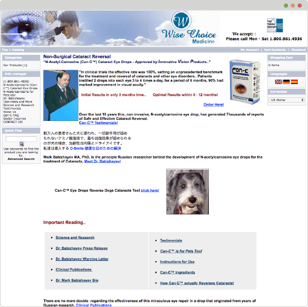
The original website was a mess, navigation was very difficult, and there were foreign languages and irrelevant information with no visual hierarchy of importance. It would take effort for a visitor to figure out how to buy from this site, and they likely wouldn’t even want to as it does not look professional or trustworthy. Information is hard to find, and it’s tough to figure out which products would be best for specific eye conditions.
Timeline ▼
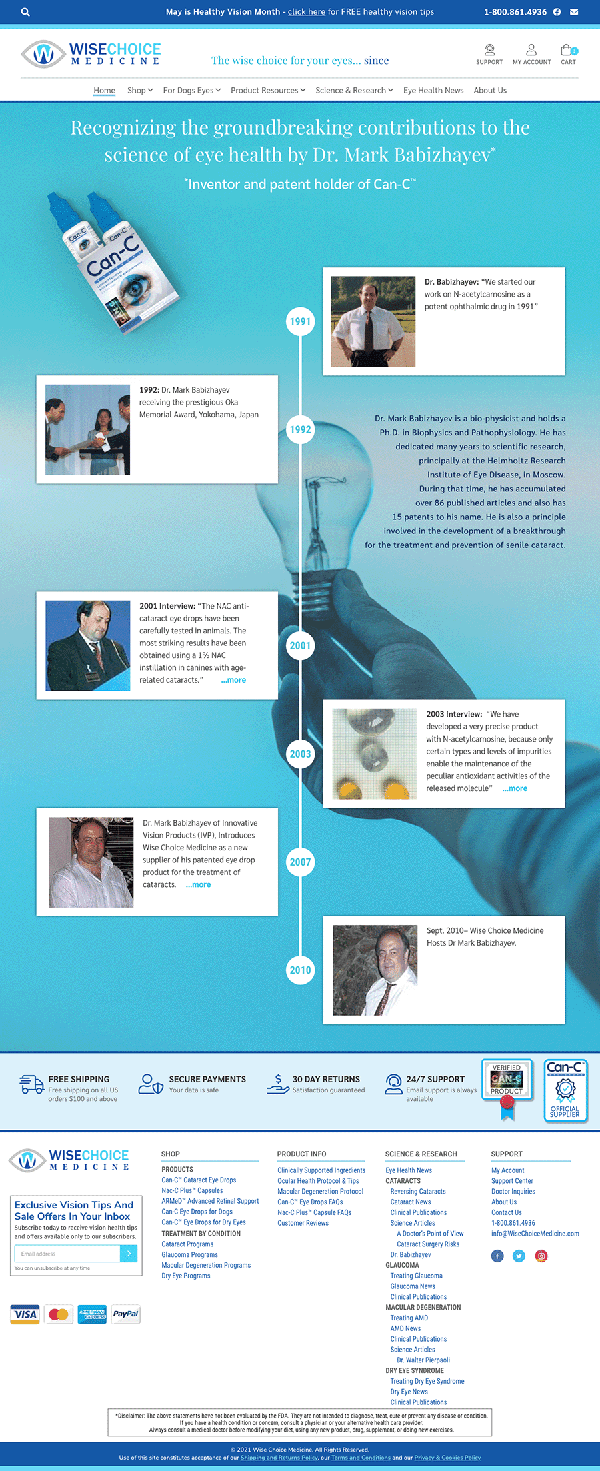
Wise Choice had a timeline on their old website, but it ran horizontally, so everything was cramped and hard to read, resulting in a jumbled and non-functional mess.
We rotated the timeline vertically, cleaned up the text significantly, and created a modern design with plenty of white space, integrating the brand’s colors and imagery. This has made for a useful sales tool that immediately brings customers up to speed on the brand’s long history and impressive scientific pedigree.
Menu Design Process ▼
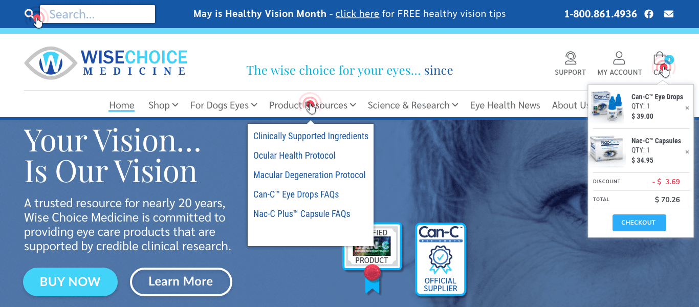
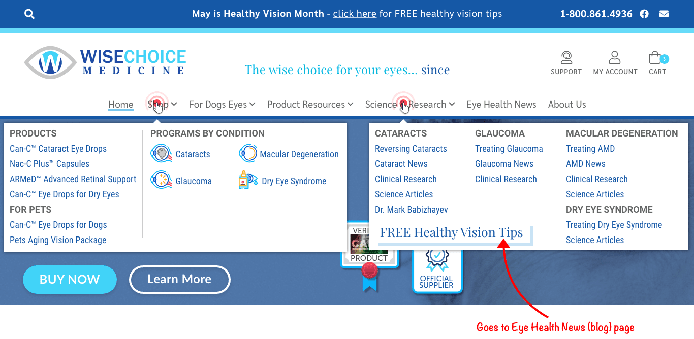
We created a comprehensive dropdown menu, greatly simplifying the website’s navigation in ways that just made sense. Now customers can navigate the site intuitively, easily finding the educational information they want, or navigating through a simplified and streamlined checkout process.
After ▼
A much cleaner look, with a recognizable brand identity and color scheme, consistent fonts, a layout with navigation that makes sense for an easy user experience, plenty of intentional white space to give elements room to breathe, and the most important information featured big up top. This clean site layout allows for an intuitive, user-friendly experience, and builds trust in the brand and its products among consumers.
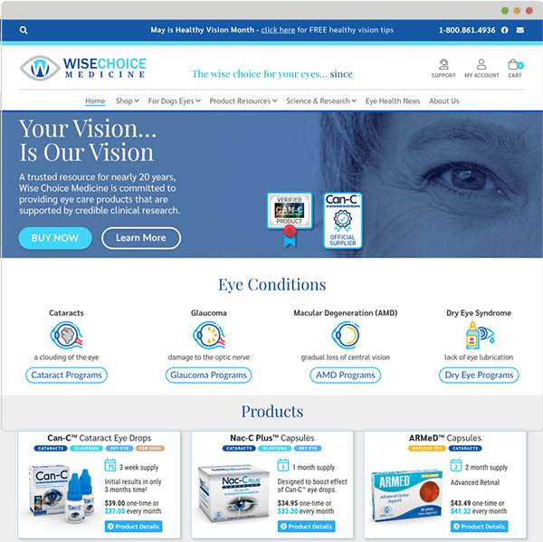
Side-by-side bundle comparison ▼
By putting their products into multiple different condition-specific bundles, we found a creative solution to their problem of having somewhat limited product offerings. Different quantities for different conditions, and a Standard and Advanced program for each have led to higher average checkout prices as well as increased customer satisfaction and product efficacy in treating specific eye conditions.
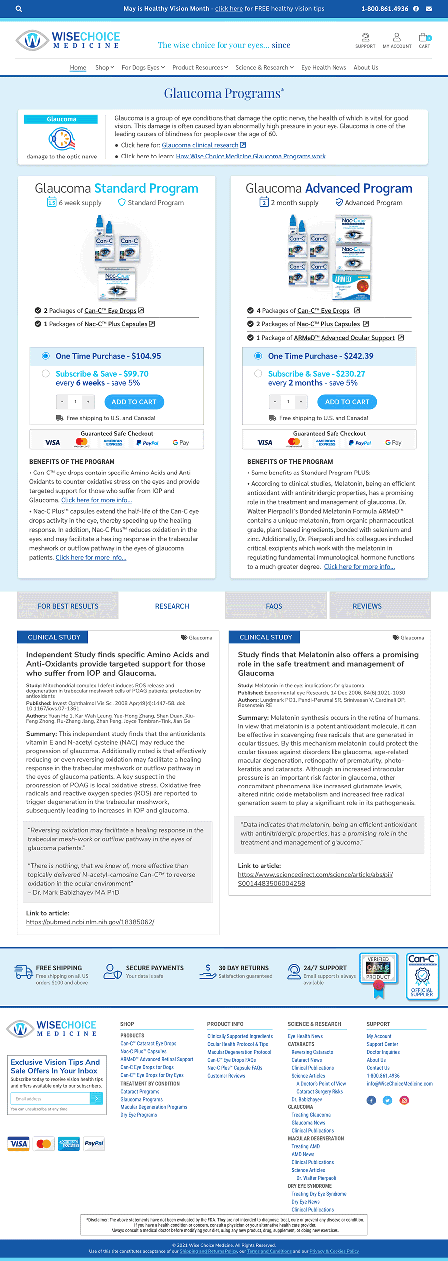
Package Design ▼
A soft-redesign, we cleaned up their packaging with cleaner fonts, better organization of info, and a bold, attention-grabbing image.
We are working on a modernized, cleaner redesign that incorporates their new logo and colors onto the packaging with more white space. ARMeD is the first product to feature the new design.
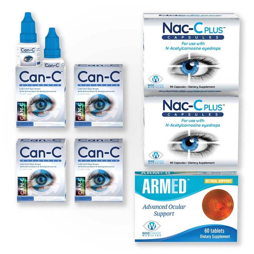

Branding ▼
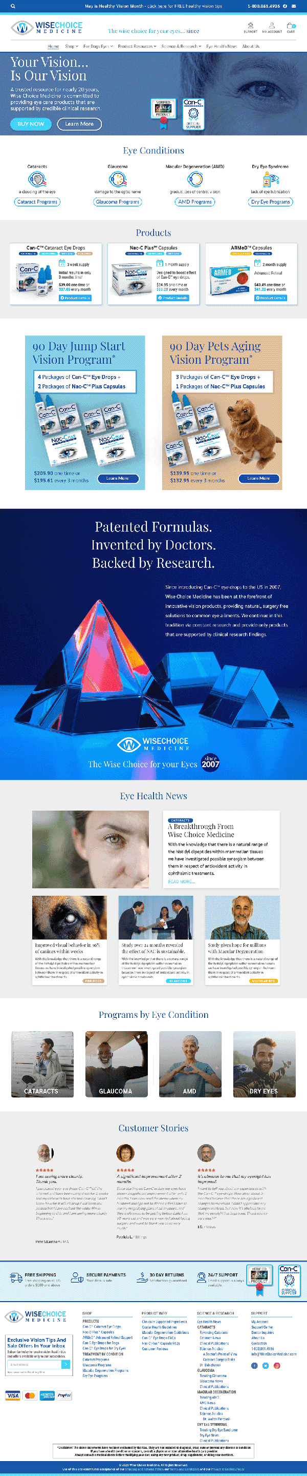
Home Page Design
We organized the home page with a hierarchy of information in mind, so that visitors’ eyes are drawn to the right stuff in order from most- to least-important.
It is immediately made clear that their business is eye health supplements, and the “Eye Conditions” section helps them easily find the right program for their unique needs. A well-organized menu in the header allows for easy, user-friendly navigation of the site.
Beneath the fold, we have individual products shown, as well as 2 “ads” for their best-selling 90-day bundles for humans and pets. An eye catching image and bold, informative text helps lead people through the page, followed by snippets of the latest eye health news that helps solidify them as an authority in their industry.
Then, condition-specific programs are shown again, this time with photos that bring in a human presence to the page, and that is supported by the “Customer Stories” reviews directly below. Important information like their Free Shipping and 30-Day Return Policy are featured in the footer, along with further navigation options.
key deliverables
- Simplified site architecture for better user flow
- Refined homepage layout highlighting products
- New product category and detail pages
- Optimized checkout process
- Enhanced visuals and new branding assets
improvements
Usability/User Experience (UX) Improvements: Seamless navigation reduced user friction, resulting in lower bounce rates and increased time spent on site, impacting SEO rankings positively. A user-friendly website results in users returning more often, which increases the potential for conversions.
Product Information & Details: Detailed, clear, and concisely structured product information helps users make informed buying decisions. This transparency led to increased customer trust and loyalty, enhancing sales and reducing return rates.
Conversion Rate Optimization (CRO): By making calls-to-action more prominent and engaging, we were able to guide users more effectively towards conversions - whether that’s completing a purchase, signing up for a newsletter, or filling out a contact form. This ultimately increased leads and revenue.
Optimized Checkout Experience: A streamlined checkout process minimized cart abandonment by reducing user frustration. A clear overview of costs (showing no hidden fees), a progress indicator, and guest checkout options resulted in more completed purchases.
Reseller Hub: Rather than taking people away from their website to purchase affiliated eye-health products from associated brands’ websites, we created a hub for Wise Choice to resell these products right on their own website, preventing a loss of traffic and allowing them to fulfill these orders themselves, leading to more purchases and higher average checkout prices.
Enhanced Visuals & Branding: Improved visuals not only made the website aesthetically appealing, but also enhanced brand consistency. This can leave a strong impression on visitors and enhance brand recognition, contributing to a potential increase in customer loyalty and overall sales.
Content & SEO Improvements: High-quality, SEO-optimized content helped improve their ranking on search engines, leading to increased organic traffic. Insightful and valuable content can position a brand as an authority in their industry, affecting customer trust positively.
Mobile Responsiveness: With the majority of web traffic coming from mobile devices, a responsive design ensured that the website provides a great user experience on all screen sizes. This leads to longer time spent on the site, lower bounce rates, and improved search rankings, ultimately leading to higher conversion rates.
Accessibility: Rebuilt with accessible navigation and semantics; current builds are delivered to WCAG 2.1 AA.