
Sports Illustrated Nutrition
Work / Sports Illustrated Nutrition
Sports Illustrated Nutrition offered us an opportunity to design and orchestrate a comprehensive go-to-market strategy for their new line of sports supplements. This included designing a Shopify-based e-commerce platform, creating a compelling brand identity, and also designing all product packaging. We tailored the website to present a digital reflection of the brand’s ethos, focusing on a design that would prompt user engagement and increase conversions. Our responsibility was not only to visually capture the brand’s spirit but to ensure its successful implementation across different channels, from the e-commerce website to in-store signage and beyond.
We engineered a sophisticated navigation and page structure for the Sports Illustrated Nutrition website, which included a visually appealing mega-menu. This menu showcased their products categorized by benefit, providing a consumer-friendly approach to discovering the right products. The user-centric design provides easy access to detailed product features, benefits, and conversion-optimized e-commerce features. Updated visuals and informative copy amplified their brand image as a front-runner in sports nutrition, underscored by science and comprehensive knowledge. With attention-grabbing calls-to-action, conversions significantly increased.
Our team seamlessly integrated the Sports Illustrated Nutrition site we designed with the franchise’s numerous other platform sites, creating a system-wide digital solution. This not only expanded the brand’s reach but fortified its identity, both online and offline. This project showcased our skill at crafting an interconnected website that exists under a broader franchise umbrella. We understand the essential nuances that come with such a task - ensuring brand consistency while preserving unique elements, allowing ease of administration, and making certain each website is intuitively interconnected with the others. A deep understanding of creating robust website networks under a unifying brand banner, combined with our ability to simplify complex product information into engaging visual stories, allowed us to forge a successful digital solution for Sports Illustrated Nutrition’s brand.
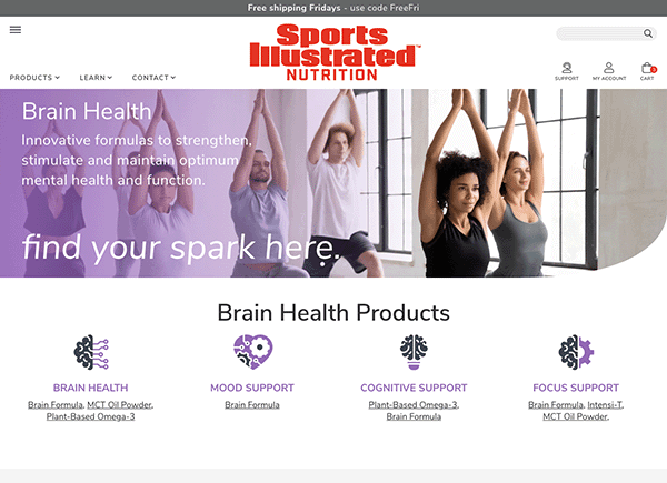
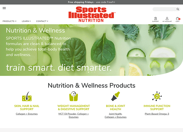
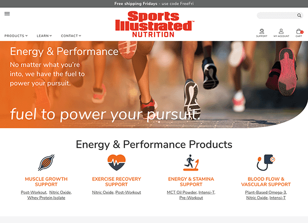
▲ Category Pages
One of our most important tasks was organizing and categorizing their product offerings. From pre-workouts to recovery supplements, every product was carefully classified to make the product search more intuitive and successful for the average user.
We strategically designed these individual category pages with color coding and consistent design elements to ensure each page echoed the brand’s identity while still possessing its own unique character and energy.
We incorporated a clear text hierarchy for quick and easy digestion of the information, speeding up and enriching the process of finding the right products to purchase.
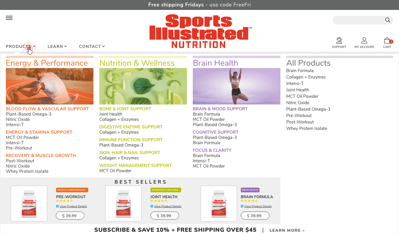
▲ Custom Programmed Mega Menu on Shopify
In terms of navigation, we delved deep into product categorization, developing a user-friendly and intuitive mega menu. Each item was clearly defined, aiding customers in their search and offering them a seamless shopping experience, whether searching by product or by benefit.
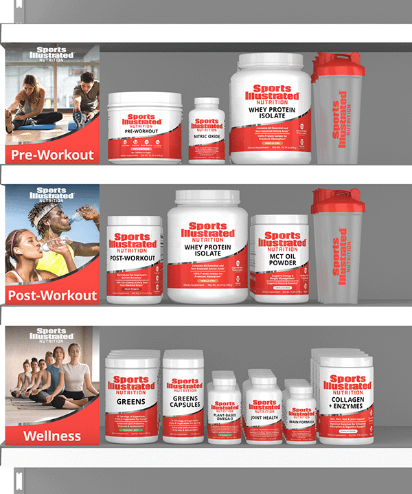
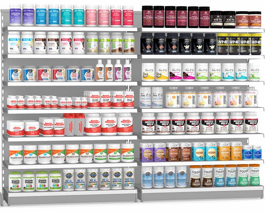
▲ In store display and key retail sales planagrams
To equip Sports Illustrated Nutrition for their interactions with big retailers, we developed comprehensive sales decks, trade show signage, product information sheets, and produced key retail sales planograms for big retailers.
These marketing collaterals ensured a consistent brand representation while highlighting the cardinal selling points.
Product Page Design ▼
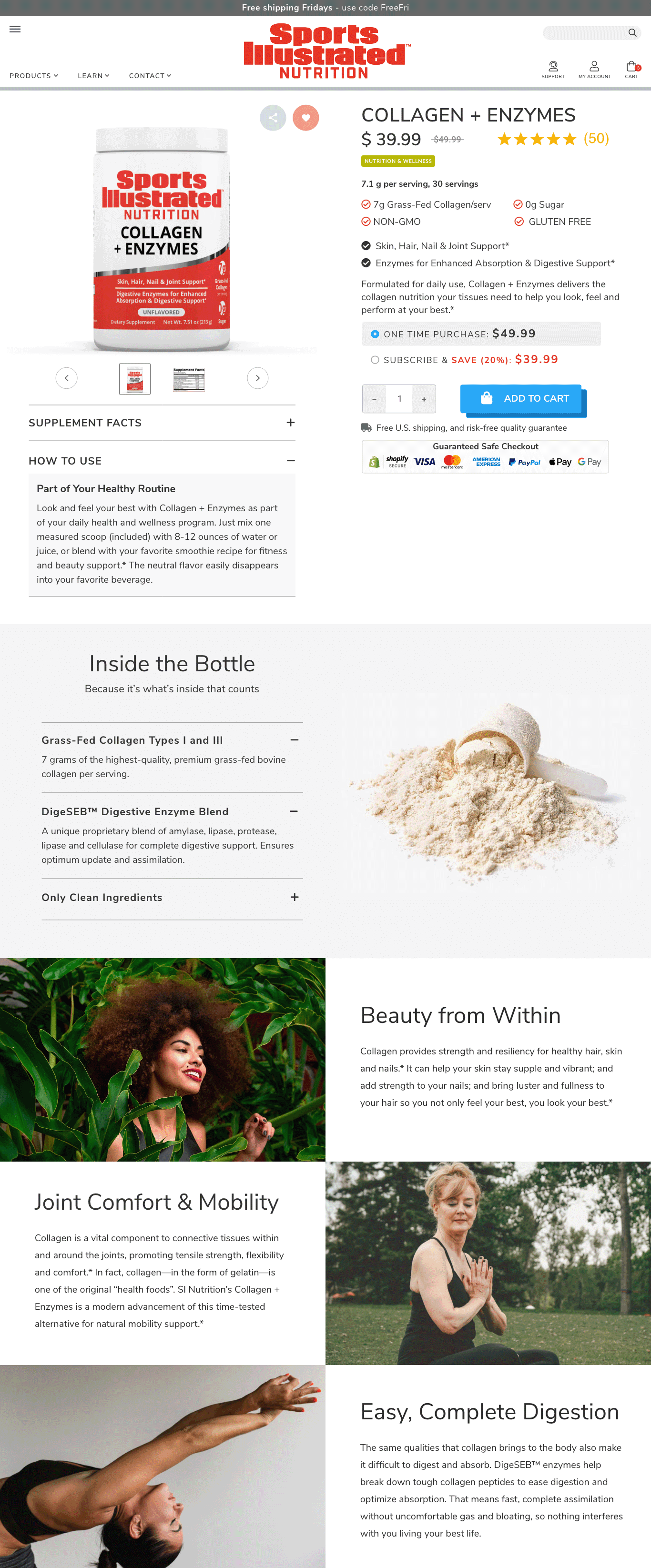
The product pages needed to combine enticing visuals with comprehensive product details. We had to find a way to take a ton of information and make it visually enticing as well as easy to read, broken up in a way that makes it more digestible.
Our aim was twofold: to educate customers with product information in easy-to-understand language, and to enthrall them with high-quality visuals, converting casual browsers into confident customers.
We sourced high-quality images, and created 3D visuals that provided a virtual touch-and-feel experience. Every element was focused on creating an ideal user experience for customers.
Label Design ▼
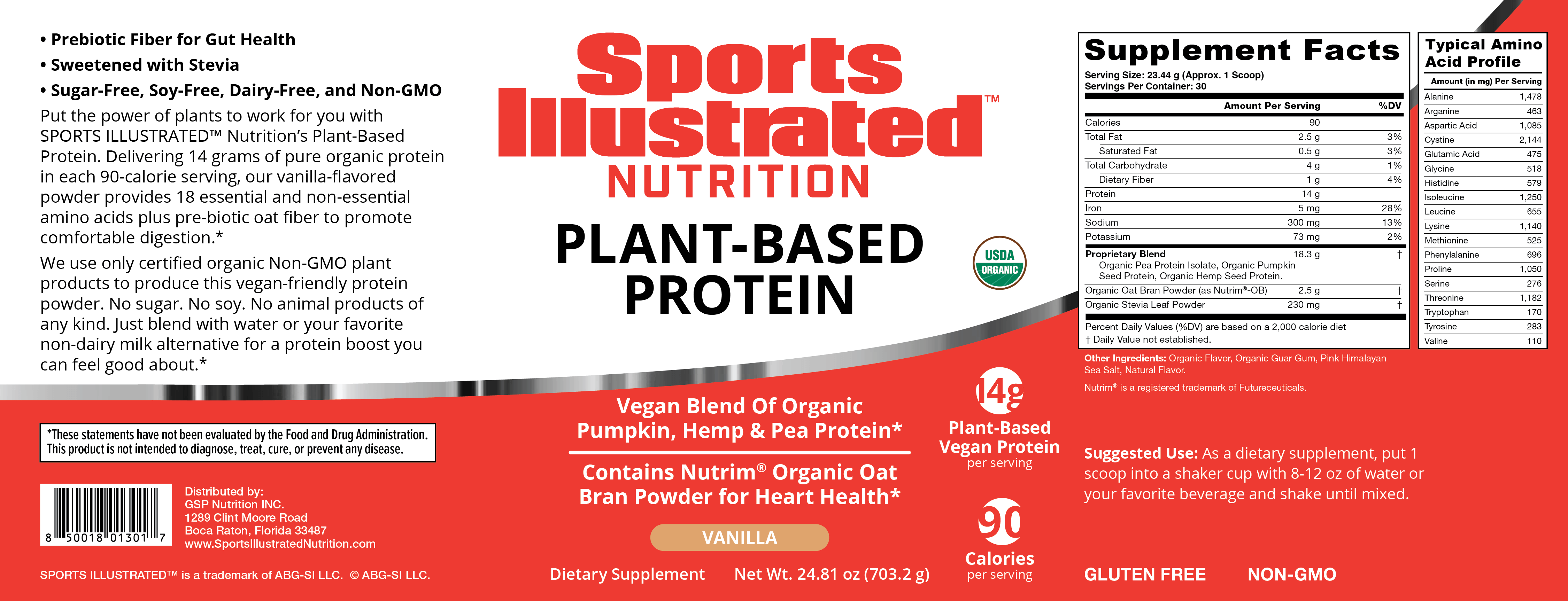
Bold and featuring the iconic shade of Sports Illustrated red, these labels exude energy. A swooping red curve rises from left to right, creating a sense of movement that is bolstered by the strip of metallic foil that rests on top. Bold, modern callouts stand out in white against the red. The white upper section provides breathing room and comfort in the negative space, altogether creating a look that is equal parts premium and modern.

▲ Branding
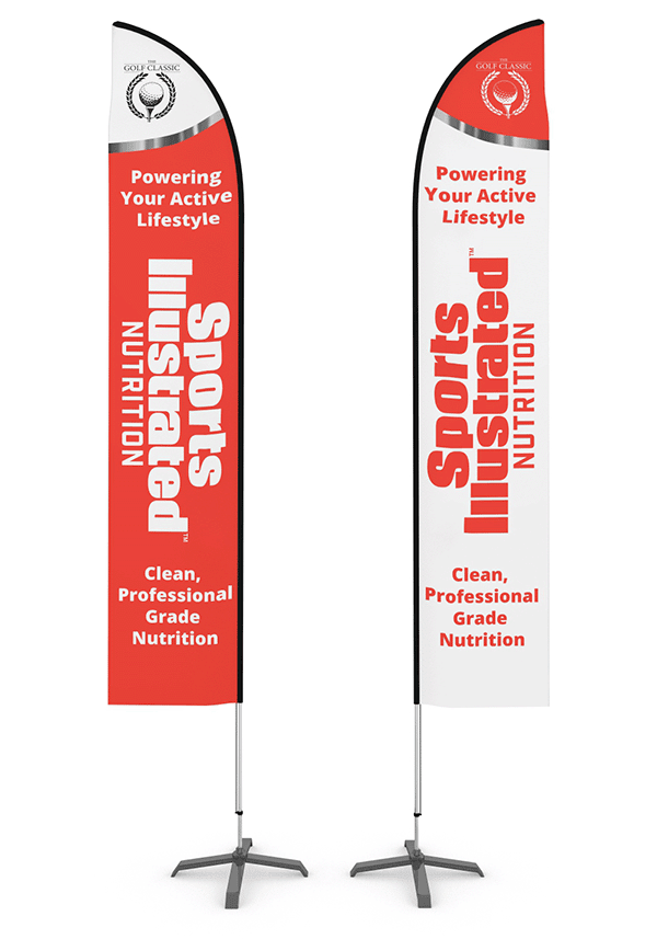
Our partnership with Sports Illustrated Nutrition extended beyond the digital realm. We stepped into the customer’s physical universe, crafting in-store signage designed to catch consumers’ eyes.
▲ Home Page Design
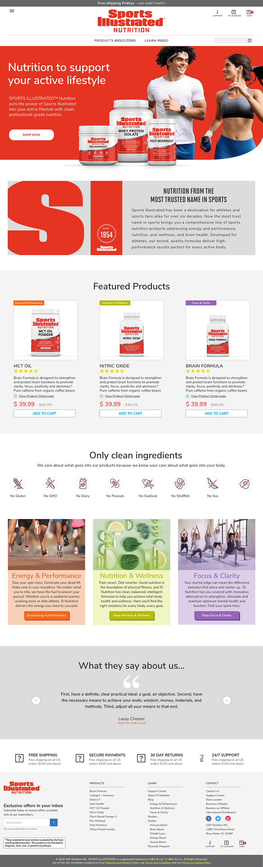
The home page was designed with typographical hierarchy in mind, with the eye immediately drawn to a healthy and happy young couple as well as the bold and premium-looking product renderings and a call to action to purchase nutritious products for a healthy lifestyle.
The menu bar was simplified into 3 dropdown items: “products,” “learn,” and “contact,” creating simplified and user-friendly navigation.
A key to our effective collaboration was the use of Adobe Experience Design (XD) for developing our model prototypes. Adobe XD provided us a collaborative platform to articulate, visualize, and share ideas, test assumptions, and navigate through the design process. It empowered the client to review, provide feedback, and markup changes, fostering a more efficient back-and-forth that enabled us to create designs aligned with client expectations.
▲ Maintaining a Brand While Growing It
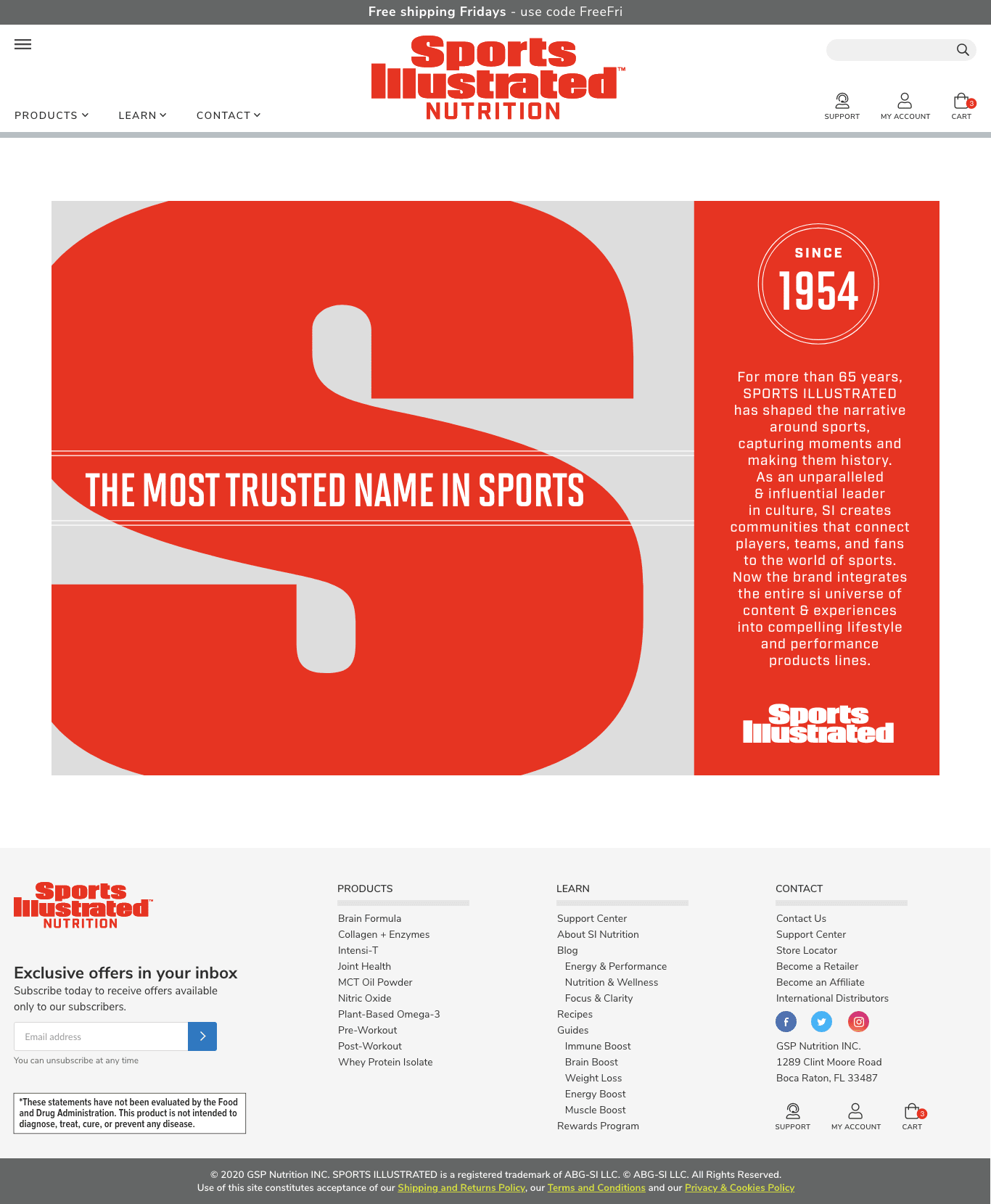
One of the unique challenges was striking a balance between maintaining the strong, established brand while still allowing it to grow and adapt to the dynamic supplement market. Our team deftly navigated through this, reinforcing the familiar aspects of the brand while simultaneously allowing for innovation and expansion. We ensured that the values Sports Illustrated is renowned for were not diluted in the transition.
key deliverables
- Brand Identity design, including an updated logo and product packaging designs that reflect the brand’s values and trustworthiness as a leader in premium sports nutrition
- Intuitive site architecture, crafted to enhance user navigation
- A refined homepage layout, spotlighting their product range
- Developed new product categories and detailed pages
- Streamlined the checkout process for an improved user experience
- Timeless, high-quality visuals and brand assets that mirror the brand’s long-term vitality and premium aura
important features
Usability/User Experience (UX): Smooth navigation lowered user friction and bounce rates while boosting time on site and SEO rankings. User-friendly design promoted repeat customer visits and conversions.
Product Information & Details: Clearly presented comprehensive product information empowered customers to make informed purchases. This built trust, boosted sales and lowered return rates.
Synergy With Brand’s Other Sites: It was important to make this website a clear part of the Sports Illustrated brand’s family, both visually and with its functional interconnectivity with their other sites.
Conversion Rate Optimization (CRO): Vibrant, noticeable calls-to-action channeled users efficiently towards conversions, increasing leads and boosting revenue.
Optimized Checkout Experience: A simplified checkout process lowered cart abandonment rates. Transparent cost display and guest checkout options ensured higher purchase completions.
Enhanced Visuals & Branding: Uplifted visuals reinforced brand consistency and made a lasting impression on visitors, enhancing brand loyalty and sales.
Content & SEO Improvements: Increase in organic traffic through SEO-optimized, high-value content. Established the brand as an industry authority and solidified customer trust.
Mobile Responsiveness: A responsive design guaranteed an excellent user experience across all devices, increasing site interactions and conversion rates.
Accessibility: Built responsive and accessibility-conscious; current builds are delivered to WCAG 2.1 AA.